Note
Go to the end to download the full example code.
Unsupervised learning#
This tutorial demonstrates how to use TabICL for unsupervised tasks.
import numpy as np
import matplotlib.pyplot as plt
from sklearn.datasets import make_moons
from tabicl import TabICLUnsupervised
TabICLUnsupervised supports density estimation and outlier detection
through score_samples, missing-value imputation through impute,
and synthetic data generation through generate.
Note
Compared with tabicl.TabICLClassifier and
tabicl.TabICLRegressor, tabicl.TabICLUnsupervised is an
experimental implementation, which has not been evaluated on large
benchmarks. Use with caution.
Fit the model#
We use the classic two-moon dataset with only 200 samples so inference stays fast.
X, y = make_moons(n_samples=200, noise=0.15, random_state=42)
Similarly to TabICLClassifier or TabICLRegressor, calling fit()
only stores the training data and loads the shared model weights once.
Outlier detection with score_samples()#
Density estimate, outlier detection and data generation rely on an estimation of the joint probability density \(P(X_1, \ldots, X_d)\). TabICL approximates this using the chain rule:
where each conditional is predicted by a TabICL classifier for categorical features and a TabICL regressor for numerical features.
score_samples() estimates the joint density by averaging chain-rule
log-probabilities over several random feature orderings. The parameter
n_permutations controls how many orderings are averaged. Higher scores
indicate more typical data points; lower scores flag outliers.
We start by visualising the learned density, which underlies all downstream tasks.
# Create evaluation grid
h = 0.2
xx, yy = np.meshgrid(np.arange(*xlim, h), np.arange(*ylim, h))
X_grid = np.c_[xx.ravel(), yy.ravel()]

# Compute scores on the grid
scores_grid = model.score_samples(X_grid, n_permutations=4)

# Draw learned density plot
fig, ax = plt.subplots(figsize=(5, 4), constrained_layout=True)
cf = ax.contourf(
    xx,
    yy,
    scores_grid.reshape(xx.shape),
    levels=20,
    cmap="YlOrRd",
    alpha=0.85,
)
ax.scatter(X[:, 0], X[:, 1], c="black", s=10, alpha=0.6, label="Training data")
ax.set(xlabel="Feature 1", ylabel="Feature 2", xlim=xlim, ylim=ylim)
plt.colorbar(cf, ax=ax, label="Density score")
ax.legend(frameon=False)
plt.show()
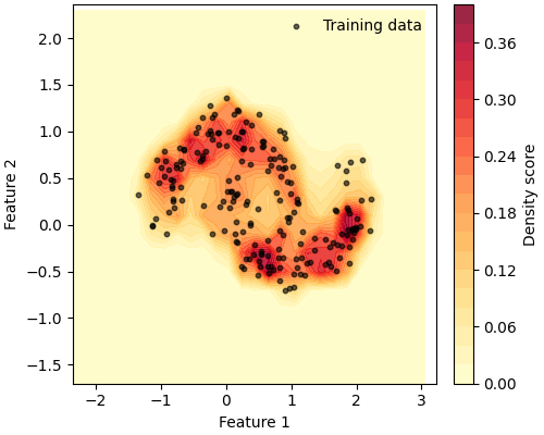
The model correctly assigns higher scores to the dense crescent-shaped regions, and lower scores to the sparse areas in between and around the moons.
Now let’s inject a handful of outliers and compare their scores to those of the normal training points.
# Create outliers
outliers = np.array([[-1.2, 1.2], [2.2, -0.8], [0.5, 1.8], [-1.5, -0.8], [2.5, 1.0]])
X_all = np.vstack([X, outliers])
is_outlier = np.array([False] * len(X) + [True] * len(outliers))

# Compute scores using TabICLUnsupervised
scores_all = model.score_samples(X_all, n_permutations=4)

# Plot scores and outliers
print(f"Normal score range:  [{scores_all[~is_outlier].min():.4f}, " f"{scores_all[~is_outlier].max():.4f}]")
print(f"Outlier score range: [{scores_all[is_outlier].min():.4f}, " f"{scores_all[is_outlier].max():.4f}]")

fig, ax = plt.subplots(figsize=(5, 4), constrained_layout=True)
sc = ax.scatter(
    X_all[:, 0],
    X_all[:, 1],
    c=np.log1p(scores_all),
    cmap="YlOrRd",
    s=30,
    edgecolors="none",
)
ax.scatter(
    outliers[:, 0],
    outliers[:, 1],
    facecolors="none",
    edgecolors="blue",
    s=120,
    linewidths=2,
    label="Outliers",
)
ax.set(xlabel="Feature 1", ylabel="Feature 2")
ax.set_title("Log-density scores (outliers circled)")
plt.colorbar(sc, ax=ax, label="log(1 + score)")
ax.legend(frameon=False)
plt.show()
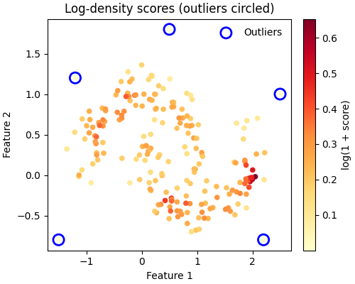
Normal score range:  [0.0883, 0.9228]
Outlier score range: [0.0000, 0.0004]
Outliers receive much lower scores, confirming that the model has successfully learned the underlying density and can flag anomalies.
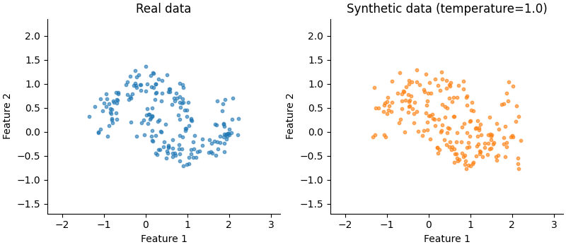
Synthetic data generation with generate()#
The learned density can also be used to generate synthetic data. This is done autoregressively by sampling each feature from its conditional distribution given the previously sampled features, using the learned conditionals \(P(X_k | X_{<k})\).
The temperature parameter controls diversity — values near 0 give
near-deterministic (mode) samples, while 1.0 reflect the full distribution.
# Generate synthetic data with TabICLUnsupervised
X_synth = model.generate(n_samples=200, temperature=1.0)

# Plot the generated data
fig, axes = plt.subplots(1, 2, figsize=(8, 3.5), constrained_layout=True)

axes[0].scatter(X[:, 0], X[:, 1], s=10, alpha=0.6)
axes[0].set_title("Real data")

axes[1].scatter(X_synth[:, 0], X_synth[:, 1], s=10, alpha=0.6, color="C1")
axes[1].set_title("Synthetic data (temperature=1.0)")

for ax in axes:
    ax.set(xlabel="Feature 1", ylabel="Feature 2", xlim=xlim, ylim=ylim)
    ax.spines[["top", "right"]].set_visible(False)

plt.show()
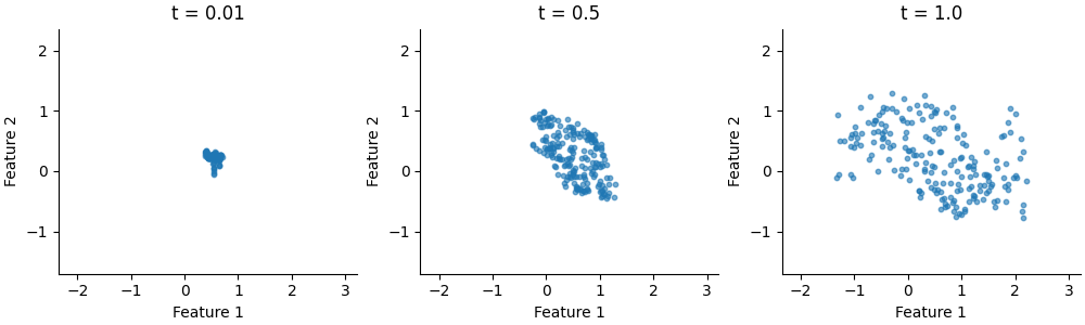
A quick temperature sweep shows the effect: low temperatures concentrate
samples around high-density modes, while temperature = 1.0 reproduces the
full spread.
temperatures = [0.01, 0.5, 1.0]
fig, axes = plt.subplots(1, 3, figsize=(10, 3), constrained_layout=True)

for ax, t in zip(axes, temperatures):
    X_t = model.generate(n_samples=200, temperature=t)
    ax.scatter(X_t[:, 0], X_t[:, 1], s=10, alpha=0.6)
    ax.set_title(f"t = {t}")
    ax.set(xlabel="Feature 1", ylabel="Feature 2", xlim=xlim, ylim=ylim)
    ax.spines[["top", "right"]].set_visible(False)

plt.show()
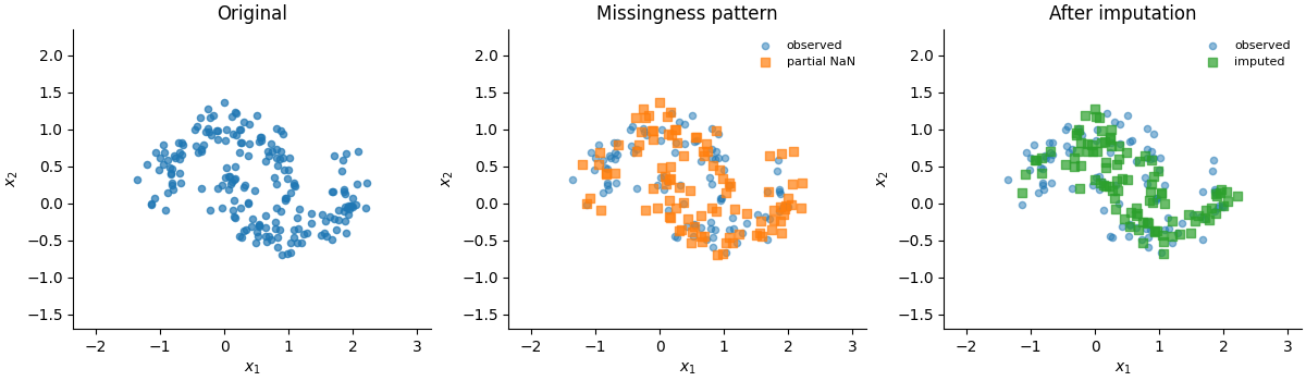
Missing-value imputation with impute()#
Finally, the learned conditionals can be used to fill in missing values.
impute() performs a MICE-like procedure (similar to Scikit-Learn’s
IterativeImputer), iteratively imputing missing values for each feature
by sampling conditioned on the current values of all other features.
A low temperature (near 0) gives deterministic imputation close to the conditional median, while a temperature of 1.0 samples according to the full conditional distribution, reflecting uncertainty in the imputation.
# Randomly mask one feature per row for ~50 % of the rows.
rng = np.random.default_rng(0)

# For each selected row, mask exactly one of the two features.
mask = np.zeros(X.shape, dtype=bool)
masked_rows = rng.choice(len(X), size=100, replace=False)
masked_col = rng.integers(0, 2, size=len(masked_rows))
mask[masked_rows, masked_col] = True

X_masked = X.copy()
X_masked[mask] = np.nan

is_observed = ~mask.any(axis=1)
is_partial = mask.any(axis=1)

print(f"Rows: {len(X)} total, {is_partial.sum()} with missing values, " f"{is_observed.sum()} fully observed")
print(f"Cells: {mask.sum()} / {mask.size} missing ({100 * mask.mean():.0f} %)")
Rows: 200 total, 100 with missing values, 100 fully observed
Cells: 100 / 400 missing (25 %)
# Plot the original data, the masked data, and the imputed data
fig, axes = plt.subplots(1, 3, figsize=(12, 3.5), constrained_layout=True)

axes[0].scatter(X[:, 0], X[:, 1], s=20, alpha=0.7)
axes[0].set_title("Original")

axes[1].scatter(
    X[is_observed, 0],
    X[is_observed, 1],
    s=20,
    alpha=0.5,
    label="observed",
)
axes[1].scatter(
    X[is_partial, 0],
    X[is_partial, 1],
    s=40,
    marker="s",
    alpha=0.7,
    label="partial NaN",
)
axes[1].legend(frameon=False, fontsize=8)
axes[1].set_title("Missingness pattern")

axes[2].scatter(
    X_imputed[is_observed, 0],
    X_imputed[is_observed, 1],
    s=20,
    alpha=0.5,
    label="observed",
)
axes[2].scatter(
    X_imputed[is_partial, 0],
    X_imputed[is_partial, 1],
    s=40,
    marker="s",
    alpha=0.7,
    color="C2",
    label="imputed",
)
axes[2].legend(frameon=False, fontsize=8)
axes[2].set_title("After imputation")

for ax in axes:
    ax.set(xlabel="$x_1$", ylabel="$x_2$", xlim=xlim, ylim=ylim)
    ax.spines[["top", "right"]].set_visible(False)

plt.show()
Total running time of the script: (0 minutes 16.725 seconds)