Note
Go to the end to download the full example code.
Probabilistic classification#
This tutorial demonstrates how to use TabICL for classification and how to interpret its probabilistic outputs.
import numpy as np
import matplotlib.pyplot as plt
from sklearn.model_selection import train_test_split
from sklearn.datasets import make_moons
from sklearn.metrics import roc_auc_score
from sklearn.calibration import CalibrationDisplay
from tabicl import TabICLClassifier
Generate 2D classification data#
We generate a simple two‑moon 2D dataset with fairly large noise. A 2D dataset is useful for visualisation purposes and the noise makes the classification porblem non-separable, which is a common situation in real-world applications.
X, y = make_moons(n_samples=1000, noise=0.35, random_state=0)

X_train, X_test, y_train, y_test = train_test_split(
    X, y, test_size=0.2, random_state=0
)
Fit TabICL#
The fit method just downloads TabICL weights if they have not been
downloaded already, while the predict_proba does the forward pass of the
model and returns the predicted probabilities for each class.
tabicl = TabICLClassifier()
tabicl.fit(X_train, y_train)

# Predict probabilities on test set
y_proba = tabicl.predict_proba(X_test)
Plot predicted probabilities#
Since the problem is 2D, we can qualitatively assess the quality of the model’s probabilistic predictions by plotting the decision boundary induced by the predicted probabilities.
fig, ax = plt.subplots(figsize=(5, 4), constrained_layout=True)

# Create a mesh to plot decision boundaries
h = 0.2
offset = 0.5
x_min, x_max = X[:, 0].min() - offset, X[:, 0].max() + offset
y_min, y_max = X[:, 1].min() - offset, X[:, 1].max() + offset
xx, yy = np.meshgrid(np.arange(x_min, x_max, h), np.arange(y_min, y_max, h))

# Predict probabilities on mesh
Z = tabicl.predict_proba(np.c_[xx.ravel(), yy.ravel()])[:, 1]
Z = Z.reshape(xx.shape)

# Plot decision boundary and margins
ax.contourf(xx, yy, Z, levels=20, cmap="RdYlBu_r", alpha=0.8)
ax.contour(xx, yy, Z, levels=[0.5], colors="black", linewidths=2)

# Plot training data
scatter = ax.scatter(
    X_test[:, 0],
    X_test[:, 1],
    c=y_test,
    cmap="RdYlBu_r",
    edgecolors="k",
    s=50,
    alpha=0.8,
)

ax.set(xlabel="Feature 1", ylabel="Feature 2")
ax.set_title("TabICL predicted class probabilities (2D)")
plt.colorbar(scatter, ax=ax, label="Probability of class 1")
plt.show()
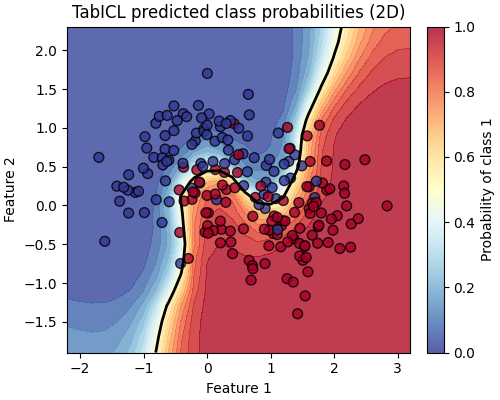
Test data points are coloured by their true label. The black contour line shows the decision boundary at a probability threshold of 0.5. The colour shading indicates the estimated probability for class 1.
It is interesting to observe that the model is less confident (probability closer to 0.5) in the noisy regions of the dataset close to the decision boundary.
We also observe even less confident predictions when we follow the decision boundary further away from the training data of this particular task. This is a desirable property: it is able to express more uncertainty in regions of the feature space that are far from the training data.
Evaluate model performance#
For probabilistic binary classifiers, ROC AUC summarizes the ranking quality of predicted probabilities independently of a fixed classification threshold.
A ROC AUC of 1.0 is perfect and 0.5 corresponds to random guessing. Since the classification task is noisy, we expect a value between those two extremes.
roc_auc = roc_auc_score(y_test, y_proba[:, 1])
print(f"Test ROC AUC: {roc_auc:.3f}")
Test ROC AUC: 0.957
In complement, we can also look at the calibration of the model’s probabilistic predictions by plotting the calibration curve:
fig, ax = plt.subplots(figsize=(3.8, 3.2), constrained_layout=True)
_ = CalibrationDisplay.from_predictions(
    y_test, y_proba[:, 1], strategy="quantile", n_bins=7, ax=ax,
)
ax.set_title("Calibration curve")
plt.show()
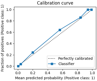
We expect TabICL to produce reasonably well calibrated probabilistic predictions by default. This is what we observe here: the calibration curve is close to the diagonal line.
Total running time of the script: (0 minutes 22.089 seconds)